
Top 6 Portfolio Design Trends
Working as a creative artist in any field is tough. To succeed it’s imperative that you have a unique voice coupled with a portfolio demonstrating your skills. These skills could range from websites, print design, icons, mobile apps, vectors, animation… the list is as bottomless as an all-you-can-eat buffet. And much like visiting a buffet, your clients want to work with someone who’s going to deliver above and beyond their expectations. The best way to prove yourself to a suspecting client is through your portfolio. Back before the Internet was super radical and cool, most portfolios were shown as physical pieces of work. Nowadays you can show off your work using a great website which can also include some personal information and contact details. Your online portfolio can be seen as an extension of your work that helps sell your talents to prospective buyers. In this article I cover an assortment of modern trends in creative portfolio website layouts, specifically focussing on graphic designers and web designers. The beauty of an online portfolio is that you get a chance to showcase your creativity and your work, allowing people to view from any device with an Internet connection. But instead of just throwing various platters into your buffet table why not take a more constructive approach? These trends should offer a durable framework of ideas that you can blend to see how they’d fit into your own portfolio website.
6
Attaining Focus
Possibly one of the more important trends to consider is a careful attention to detail. This idea spans all layout styles because focus is needed to keep attention where you want it. Everyone has some level of focus and it’s up to you to channel that focus appropriately. Think about your design not just from a designer’s perspective, but from a user’s perspective. How usable is your portfolio to a non-technical small business owner?
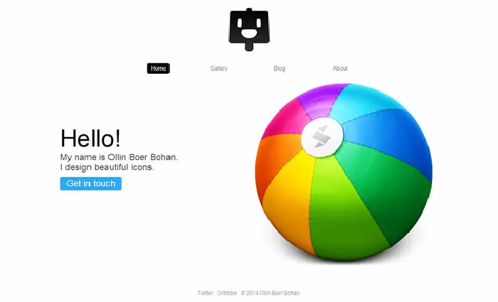
Ollin is an exceptionally talented icon designer with a lot of great work online. His portfolio is minimalist, clean, simple, and definitely performs well on any device. The focus on this portfolio always sticks to his work, or in the case of his blog it sticks to his writing. There’s nothing else distracting you and there’s no way to veer off the intended path.
By using Ollin’s website as an example I don’t mean that every portfolio should be this simple. However his site is perfect for demonstrating how to keep focus on what you want. Depending on the page you might not always want focus to be directed onto your portfolio work.
It’s more important to ask yourself why you want focus on something and how you can achieve that. Usability should always take priority over aesthetic ornamentation.
Suitable for you
28-10-2023 Tiara
19-10-2023 Tiara
17-10-2023 Tiara
11-10-2023 Tiara
10-10-2023 Tiara